How to Make a Pie Chart (or Column Chart) in Google Sheets
Quick answer
Select your table with its header row (for example A1:B6), choose Insert → Chart, then in the Chart editor go to Setup → Chart type and pick Pie chart or Column chart. Add a title under Customize → Chart & axis titles.
A chart is just a picture of your table — and Google Sheets draws it for you. Here is how to make one from a small table of sales by item, switch it to a pie chart, and name it.
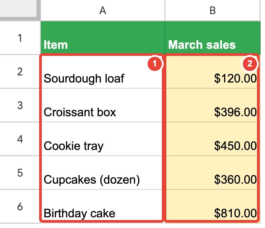
Insert the chart
- Select the table, the header row included — in our example A1:B6 (items in column A, March sales in column B).
- Choose Insert → Chart.
- A chart appears, and the Chart editor opens on the right.
Tip: Google Sheets picks a chart type for you. If it isn't the one you want, change it in the editor.
Free: which spreadsheet problem do you have?
A 6-page PDF: ten everyday Google Sheets problems and the short book that fixes each one.
Get the free overviewChange the type and the title
In the Chart editor, Setup → Chart type: choose Pie chart, Column chart or Bar chart. For "which is biggest", columns or bars are the easiest to read.
Customize → Chart & axis titles: type a title, for example March sales by item.
To move the chart, drag it. To make it bigger, drag a corner. Closed the editor? Double-click the chart to open it again.
It updates by itself
Change one number in the table and the chart changes at once. The chart reads the table every time it changes; you never redraw it.
A chart is only as good as the table under it
A chart is just a picture of your table. If the same item is typed three different ways, the chart shows three slices. If the numbers are stored as text, they're left out. If the totals are typed by hand, the chart shows last week's numbers.
Google Sheets for Absolute Beginners builds the table first — items picked from a dropdown, real numbers and dates, totals that calculate themselves — so the chart at the end is right without any fixing. Every chapter has a free practice file that tells you "OK" when you get it right.
Common questions
- My chart has no names under the bars. Why?
- The item column wasn't selected. Select the table again, then check Setup → Data range in the Chart editor.
- One bar or slice is called "March sales". Why?
- The header row was read as data. In Setup, tick Use row 1 as headers.